
This blog was written alongside Hassan El Tabch.
Didn’t we all have enough of boring PowerPoint presentations, filled with bullet points to express main ideas? A reader will not be interested in reading about the life of an author in the absence of media such as images and videos. Luckily in our Introduction to Digital Humanities course (ENGL 256B) at AUB, we were introduced to a new interactive tool: TimelineJS. It is a web-based tool that allows us to visually communicate information about an author, an event or any specific topic in a chronological manner with the freedom to add embedded media to back up the analysis. It is accessible through a program called Knight Lab.
TimelineJS enables us to present an interactive, customized timeline in a modern and attractive format. It has a slideshow format of the chronological events in an author’s life. To create a Timeline, a Google spreadsheet is generated to be filled with all the information that needs to be visualized. The homepage also provides tips and trick on how to make your timeline efficient and attractive. To be able to build a timeline, all the necessary information should be thoroughly gathered from trusted sources and then added to the Spreadsheet.
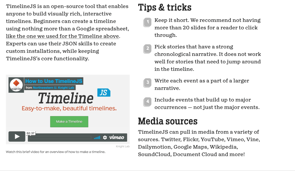
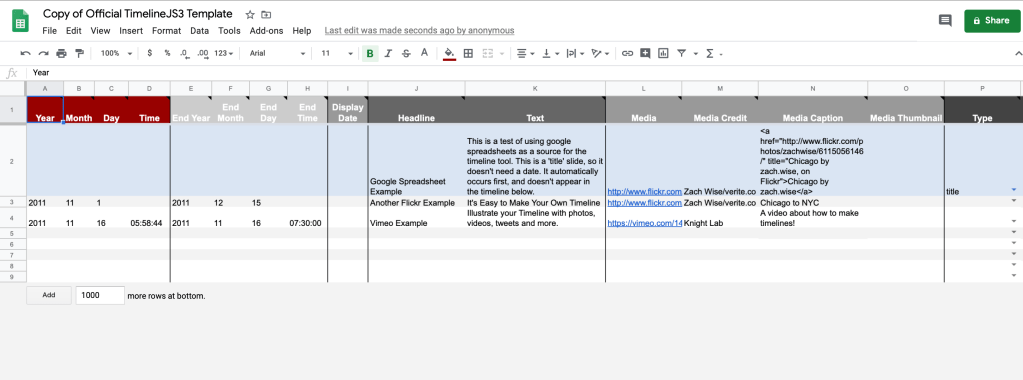
It is a user-friendly tool that allows the creation of a timeline highlighting important events about a specific topic. Furthermore, since the Google Spreadsheet is saved on the web, it allows groups to work collaboratively to create an informative timeline to complement their research. The process of creating our timeline was pretty straightforward, with the guidance of our instructor Prof. Jarkas and a YouTube Tutorial, building our timeline was a piece of cake. The platform is flexible, allowing us to embed our findings from several media platforms such as YouTube and SoundCloud as well as distant reading tools (such as Voyant tools) and Google My Maps. The outcome was a creative and aesthetically pleasing timeline that captivates the reader’s attention and makes the topic enjoyable. However, TimelineJS imposes some restrictions on the font, styling and design of the timeline, which limits the creativity of the user.
For our ENGL 256B final project, we have chosen one of the most renowned poets and novelist in English literature history, Thomas Hardy, to analyze his novels in depth using various digital tools (Voyant tools, Google My Maps…). We aim to investigate Hardy’s personal life with its various stops to unravel the context in which he wrote his novels and the impact it had on his writings, as an author cannot be separated from his work. In addition, we aimed to find answers to our research questions, sequence his life events and novels and present them in a clear and structured way. We needed a platform to represent the chronological ordering of events in addition to integrate the platforms used in our analysis. TimelineJS was the right tool to do so.

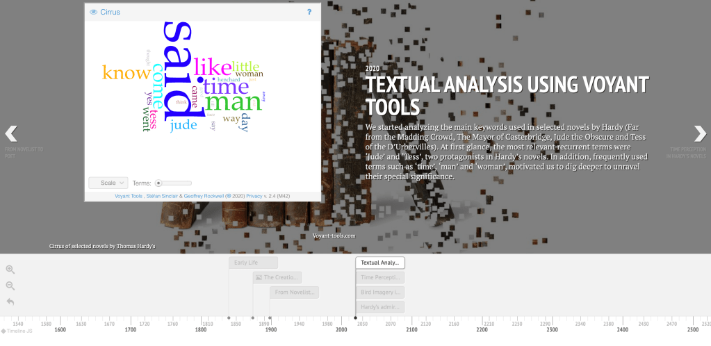
The chronological arrangement of entries emphasizes the time relations between the author and his literary works, which aided us to shed the light on unseen insights between his life and his novels. By following the progression of his life events, Thomas Hardy’s timeline unraveled the beginning of the appearance of his novels, which was after he was back to his hometown, Dorset. In addition, TimelineJS permitted us to include relevant multimedia to our topic. We included a playlist of selected poems by Hardy from SoundCloud, which gave Hardy’s words more meaning and sentiment and revealed his distinctive writing style. In addition, we added a YouTube video that takes us on a tour around his home, which showed us the scenery that surrounded him during his lifetime, and which inspired him to describe Dorset’s nature and landscape. Furthermore, embedding our results from the distant reading tools (Voyant tools) will provide the reader with the visual data that lead us to our findings and captivate his attention. Hence, the viewer becomes more involved in the author’s life and works, and TimelineJS will allow him to personally unravel insights and connections thanks to these embedded tools. Moreover, adding a GIF from GIPHY in the background, which is an animated image, made the timeline more amusing and entertaining and can make the audience more eager to read it.

In conclusion, TimelineJS turned out to be a crucial element in our project, a tool that aided us to aesthetically present our analysis. Nevertheless, TimelineJS could bear some changes to ensure a smoother experience for the user. Expanding the scope of multimedia that can be embedded is also a must to improve this tool. All in all, TimelineJS triggered our creativity to make our research more appealing to the audience, and we would definitely recommend it as a replacement for the traditional PowerPoint presentations.
 Ali's Blog